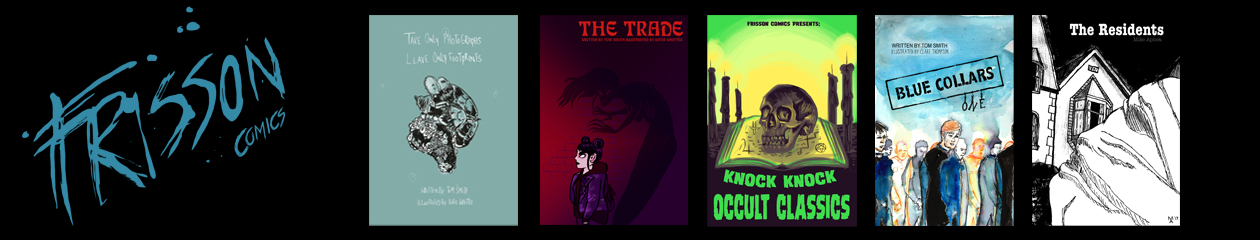
We’re onto our fifth week of creator spotlights! We’ve previously interviewed Kevin T. Rogers, Michela Cicconi, Erika Price and Allan MacRitchie to celebrate 3 years of Knock Knock zines (hurrah) This week we’re speaking to long time contributor and Frisson Comics collaborator Clare Thompson about her painterly approach to making comics and her love of mixing the organic with the synthetic.
Clare has been contributing to Knock Knock ever since way back in our second issue!

What got you into creating art?
I didn’t start with the intention of trying to be “good” at art, it was more a natural urge that I had to observe and document things. Later I started taking drawing more seriously in the sense that I wanted to practice to improve my skills. Portraiture interested me most and I’d draw people from life whenever I could. My friends at school would give me magazine cuttings of their favourite celebrities to draw for them. I studied fine art at A-level and this was when I began creating observational paintings, usually in oils. This interest meant I started life drawing quite early, from the age of 16. At college, myself and a friend who was also interested in painting would go back and use the space to practice in free periods and after lessons, we would stay and practice most nights for an extra two or three hours until the cleaners finally kicked us out. Observational painting of a range of subject matter is an on-going practice that has been part of my creative work since.

Are there any creators who influence your work and how?
When I started out I began looking at approaches to portraiture. I didn’t know anyone personally who painted or made artwork professionally and art wasn’t as accessible online as it is now. I’d mainly see artwork by reading illustrated books or visiting galleries. Rembrandt’s work stood out to me mainly because of his amazing ability to use lighting and tone to capture expression. I was also influenced by some 20th century portrait painters, admiring the way artists such as Lucian Freud and Jenny Saville used directional marks combined with tonal work to add life to their paintings. I later took inspiration from the expressive portraits of post war artists Egon Schiele and Kath Kollwitz.
I grew up in Liverpool and at 18 I took a year out from education and worked in a warehouse to save up to travel. During this time I continued to paint and became interested in the idea of depicting urban realism, of finding stories, characters and compositions within the manmade textures and decay of the urban environment. At this point the artwork I was creating was quite strict and tight with a focus aiming towards realism. Over time I developed a more fluid experimental approach to creating illustrations but also continued to practice observational drawing and painting. I think this grounding in realism still forms the basis of most of the work I make now as well as incorporating other ideas.
Part of a university project, modern adaptation of “A Harlot’s Progress”:


When studying for my illustration degree I came across the work of urban painter Jock McFadyen, I really liked the way he chose to find interest in unlikely subject matter and admired his painting style and compositions. I also liked the work of Manchester painter Liam Spencer and learned a lot about painting from looking at his use of marks. I have friends who are also painters and I always find it interesting to find out about their creative process and watch them work.
The first graphic novel I read was the wordless book The Arrival by Shaun Tan and I have followed his work and collected his books since then. I love the fact that Tan can create imagery that is ridiculously ambitious in terms of the scale of his imagination but it never quite falls over the boundary into out and out surrealism, fantasy or sci-fi. It stays grounded with touches of the mundane and familiar, inviting the reader to question what the fantasy or surreal elements might be representative of in the real world. I also like that he is now showing all the observational painting studies that underpin his practice, I find it reassuring that people whose work I admire also consider observational painting an integral part of their creative practice. It was the imaginative and experimental work of creators such as Shaun Tan, David Weisner and Dave McKean that made me realise that it wasn’t always necessary to conform to conventional methods of creating books or to stick within a genre. It was because of this desire to experiment that the idea of self-publishing appealed to me.
Stormcaller illustrations:


The first book I published in 2017 was Stormcaller, a graphic novel which started life as a short story. It soon became clear when I was designing the book that the story would lose its impact if it was fully converted to dialogue and imagery as a traditional comic layout. I wanted to keep the text and use it as an additional mode of communication but was worried that people might think I was somehow cheating by not conveying every part of the story through imagery. It was reading hybrid books such as The Savage by David Almond and Dave McKean and later discovering the diverse range of experimental comics and zines being made by independent creators and having conversations with them (including you at Frisson!) that gave me the confidence to make my own creative decisions based on what I thought was the best way of telling the story.
Do you have a favourite piece of horror media?
For me, horror works best when elements related to fear, fantasy or the paranormal are used as metaphors or to provoke an emotional response that deepens the impact of the narrative’s context. I think some of the films by Guillermo del Toro do this really well and The Devil’s Backbone is a personal favourite. Not sure whether it would be technically classed as horror or comedy but I also loved the originality of the Inside Number 9 series’ from Reece Shearsmith and Steve Pemberton.
Do you have any projects coming up?
I’m working on a few different things including a long-term solo graphic novel project, a set of printed collections of painting studies documenting treasures from the natural world and a drawing project exploring spaces within the architecture of Chester where I live. I’m also interested in the possibility of starting up a zine that focuses on the approaches and processes of different artists but I’m still working out the logistics of that! The project I’m closest to finishing is illustrations for Blue Collars Issue Two. This is a collaboration comic series written by Tom from Frisson. It is a story set in an alternate dystopian future, a new industrial revolution where totalitarianism reigns under the guise of philanthropy. Issue 2 begins by following the story of Katja and Marek, immigrants to this society who are struggling to help someone in need. Issue Two will be available to order on Kickstarter from the end of May.


Your work has a very painterly style more reminiscent of a fine arts background, what materials do you enjoy using the most?
I suppose it depends on the piece and the look I’m trying to achieve really. I will probably always enjoy pencil drawings and painting in oil because it was what I did most early on and training this way has given me a practical and tactile understanding of colour mixing and tone that feels quite natural now though I am always practicing and trying to improve. I’d say I’m most comfortable with my images when they look like they are made of something real whether that’s paint or paper or objects so it’s rare that I’ll produce a fully digital image.
Watercolour and ink give a beautiful translucency and atmosphere that you can’t achieve in any other medium. There is a sense of handing over control when it comes to these materials that doesn’t happen with opaque paints unless you dilute them. It’s never possible to know exactly what the finished piece will look like so it is the perfect medium for experimentation. For my illustrative work I mainly use ink and watercolour. Collaging fragments together is something that I started exploring a couple of years ago and have gradually been experimenting with more and more. I find that contrast between organic, fluid marks and the controlled, sharp edges and structure created through collage visually interesting and it also has the potential to add another layer of meaning or expression to a piece. I enjoy playing with surface layers in my painting studies and using collage is an extension of this.
It is usually the case that any interesting elements that I choose to add into my illustration work have started life either in painting studies or pieces I created for no purpose. When you take away the focus of the end product and just make art for it’s own sake I think it becomes easier to have new stylistic ideas that can then be used in narratives. That’s why I find it so important to do both.


Your work tends to focus on the interplay between the organic and the synthetic who or what inspires these themes in your work?
Yes! I’d say that is a contrast I often use. I think as creators we are always looking for shorthand or symbolic ways to describe and represent the experiences we are having and the world we are living in. We are organic beings but the majority of us in the West live in synthetic, manufactured environments that are more fragile than we choose to believe. I often wonder how many times in history civilisations have risen and fallen again.
As a child I was intrigued by the industrial revolution initially because of the imagery and artefacts I’d seen. I am visually interested in technology from this time because it was still possible to see how things worked through normal observation. Growing up in North-west England there were plenty of places to go and learn about this era and I was interested in finding out what it was like for people then. I knew that Liverpool was the birthplace of the first steam engine which was the seed of industry, manufacturing and of Western civilisation and capitalism as we know it. It was also a major port and point of trade during this period and was home to some of the wealthiest families in the world. But it was the realisation that this was also built on the exploitation of others; the slave trade and the children and labourers in the textile industry, that made me realise there was another side to the story. I read personal accounts written by people at the time and I think that this was the first time I became aware that to some, often those in positions of power, people are a resource to be used. The fusing of the mechanical with the biological, human form can be seen as symbolic of this.
Illustrations from my ‘Man and Machine’ series:


What scares you the most?
I have a recurring nightmare of standing in front of an open window at night. Instead of a night sky dimmed by light pollution and clouds I can see the planets looming as gigantic orbs in the sky and every detail and crater on them is visible. I can see huge chunks of rock flying around them and through the sky. It’s like there is no distance or visual barrier between the Earth and space and I feel overwhelmed with a sense of being tiny, vulnerable and subject to the elements. The panic usually wakes me up and I tell myself it was just a dream but what scares me the most is that I know deep down that it isn’t. Living in modern society lulls us into a false sense of security that we are safe and detached from the reality of nature. A reality we haven’t even come close to understanding.
What’s your favourite piece that you’ve submitted to Knock Knock? ‘
One of the positive challenges of creating work for Knock Knock has been the format, creating something to say that is meaningful in a short form. (As you can probably tell from the length of my answers, I don’t find that easy!) This forces me to think creatively and edit down thoughts to the essence of what I want to express. I also see it as an opportunity to experiment with stylistic ideas.

I have always found it useful to use loose parts (small objects, cut out paper etc) as reference and to build compositions for story-boarding, but recently I’ve been focusing on the idea that this transient process can actually be expressed as the final illustration or be incorporated into it in some way. My recent wordless book Junk DNA was an expression of this idea amongst other things! Junk DNA was composed purely through the arrangement of objects so it may look visually like a completely different process from the rest of my illustration work but the pieces I have created subsequently including the one-page comic for the recent Pestilence issue have followed on directly from the same line of thinking. The idea was to compose the images by collaging ink drawings together as I mentioned earlier. Rather than drafting and re-drafting the editing occurs in the removal and replacement of component parts and so the working process is revealed in the image itself. I would say that this idea of showing creative play and process is a thread that runs through most of my work. Visually, I don’t like things to be too finished or perfect and I think that stems from the enjoyment in being able to see how something has been made. So I’d say the piece for the Pestilence issue would be my favourite as it represents a culmination of ideas that I intend to carry on using in future work.


You can keep up with Clare’s work and projects through her website here.You can also follow Clare’s process on her Instagram and Facebook Page.
Grab Clare’s fantastic art and books at her Etsy!
Don’t forget you can catch up with our previous zines in our zine archive!


